Photorealism Painting Techniques
This is Page 11 of a 15-page guide explaining how to paint photorealistically.
Welcome to Part 3 of my free Step-by-Step Guide: How to Paint Photorealistic Acrylic Paintings! Parts 1 and 2 laid out all the prep work needed to paint photorealistically in acrylics. Part 3 gets to the fun part: painting!
So let's see where we're at:
By now you've transferred your reference photo on your canvas or wood panel. You've acquired all the necessary art supplies. You're roaring to go. Time to learn some photorealist painting techniques. So what's the next step?
1. Gesso
Yup, gesso. At this point, you either have graphite or pencil marks on your canvas. You can go ahead and start the underpainting if you want, but you might have to tolerate streaks from the graphite or pencil.

To prevent this, I use a thin, flat brush and apply a thin layer of gesso over the entire canvas, making sure that the sketch is still completely visible. This thin layer of gesso will "seal" in the graphite marks, so when the gesso dries, you can begin the process of underpainting without dealing with streaks from the preliminary drawing.
Make sure that the gesso is not too thick, as you don't want it so opaque that you can't easily see your pencil lines! Also make sure that the gesso is not too watery and runny, otherwise the pencil marks will streak too much.
When you apply the gesso over your pencil marks (or if you opt not to gesso, and dive straight into the underpainting), there may be some degree of streaking from the graphite. In my opinion, it's better to get the streaking over and "locked in" right from the start, rather than deal with streaks every time you add paint on top of the pencil marks.
2. Underpainting
Now that the painting has been gessoed, you are ready to do the underpainting. To "underpaint" basically means to quickly lay down important visual information in paint. Don't worry about details or getting everything perfect, as you'll be doing that later. For now just paint in the shadows, highlights, and basic colors.
Check out this reference photo, followed by the underpainting to see what I mean:
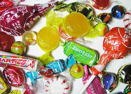

You can see the graphite transfer, which has been coated with gesso. Then I started the underpainting.
My method of working is to identify the different color areas. I normally work in one color at a time. Meaning, if there are several objects in the painting that are a similar shade and hue of red, I'll paint in all those red parts. Same for every other color. I go through them all, one at a time. Working one color at a time is generally much more efficient than working on one object at a time.
I generally tend to paint in the shadows first. Once the shadows are painted, it helps me get my bearing with "where I'm at" in the piece. For shadows, I never leap in with a pure, strong black. I start with a raw umber mixed with ivory black. I keep the paint very watery and/or use glazing liquid. If there are important details, like text (the text on the Tootsie pops, for instance), I carefully paint them in, but I don't get too caught up in the details. The painting will not look perfect at this stage, and it shouldn't! Photorealist painting is a gradual building process. For example, here is a close-up of the top left corner. You can see how I quickly block in the text on the Tootsie pop wrapper, but it is by no means perfect at this stage:

Just like the graphite tracing itself, the underpainting basically serves as a visual reminder of where things go. In general I would recommend completing the underpainting first, before you delve into perfecting the minute details.

The work-in-progress painting above displays the full variety of stages that photorealist paintings go through. You can see that some parts are completely finished, others are half-finished, and some are only just begun. The objects that are on the bottom right are in the "underpainting" stage. The objects at the top are completed, and the objects in the middle are somewhere in between. So you can see how as you build and layer more colors, the painted objects transform from looking flat and simple to looking 3-dimensional and realistic.
Pretty cool!
The most important thing to remember at this stage is not to worry about making everything look good. Just relax and concentrate on filling in all the colors. Making the painting look good is the next step!

The books below are available on Amazon. As an Amazon Associate I earn from qualifying purchases.

The North Light Illustrated Book of Painting Techniques

An Introduction to Acrylics
Painting in Acrylics: The Indispensable Guide